App redesign for Washington & State bus stop in Chicago
Introduction
2022/Mobile App
Role:
Usability testing, Surveys, Sketches, Low-fidelity prototypes, High-fidelity prototypes, Research, Competitive analysis, Interviews, User Personas, Wireframes, & Brand Logo creation.
Date:
Spring 2022
Usability testing, Surveys, Sketches, Low-fidelity prototypes, High-fidelity prototypes, Research, Competitive analysis, Interviews, User Personas, Wireframes, & Brand Logo creation.
Date:
Spring 2022
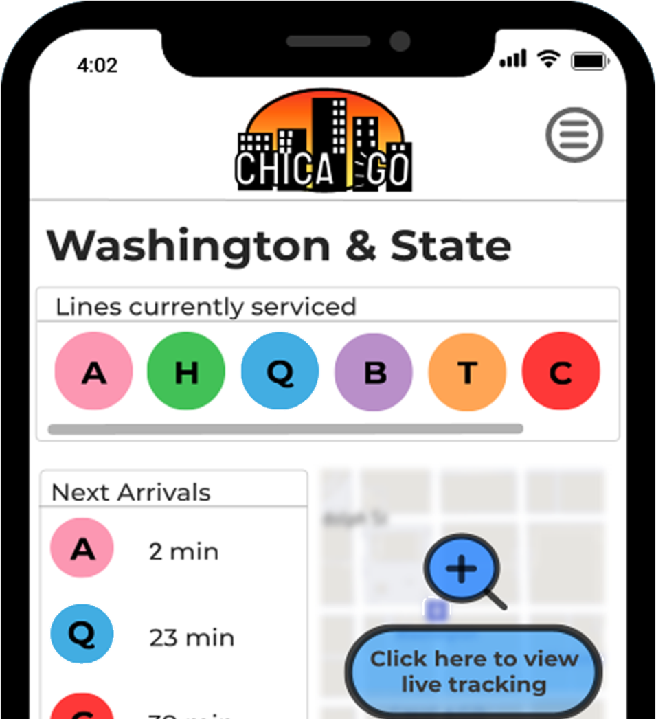
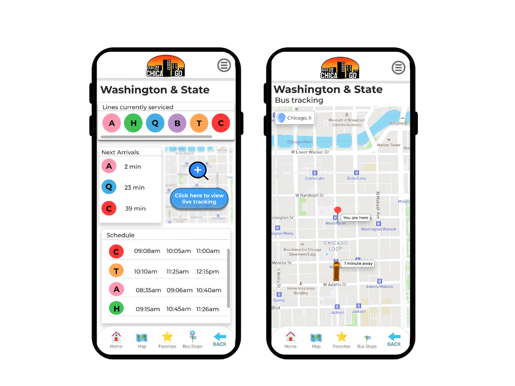
Bus stop details
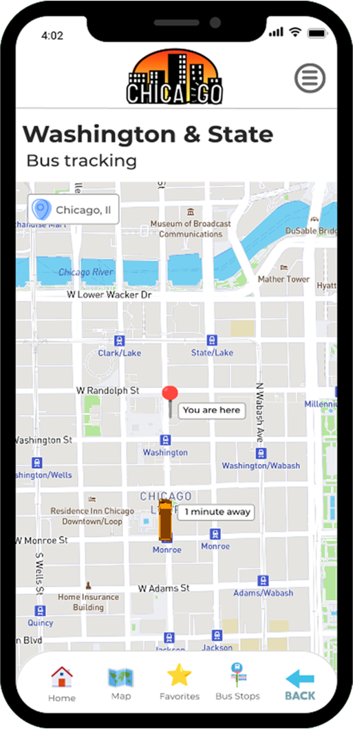
Bus tracking
Summary
The goal was to create a bus app that made catching the right bus easier and less confusing, specifically for Washington & State bus stops, due to expansion; this is where my app ChicaGO comes into play.
The simplicity of tracking where your bus is specifically on the map if there are any accidents, traffic delays, or general delays was an addition to my transit app project.
Problem
Due to expansion, numerous bus routes have recently been added, causing it to be stressful to catch the right bus. Many of these routes stop at the same bus stop. Riders want to know when the next bus will arrive at each bus stop. They also want to know how much time they have to get to the bus stop.
Bus riders could rush to the bus stop when they see a bus coming–but that doesn’t work anymore since it might not be the bus they’re expecting.
Bus riders have complained about the Washington & State bus stop, served by seven lines.
Solution
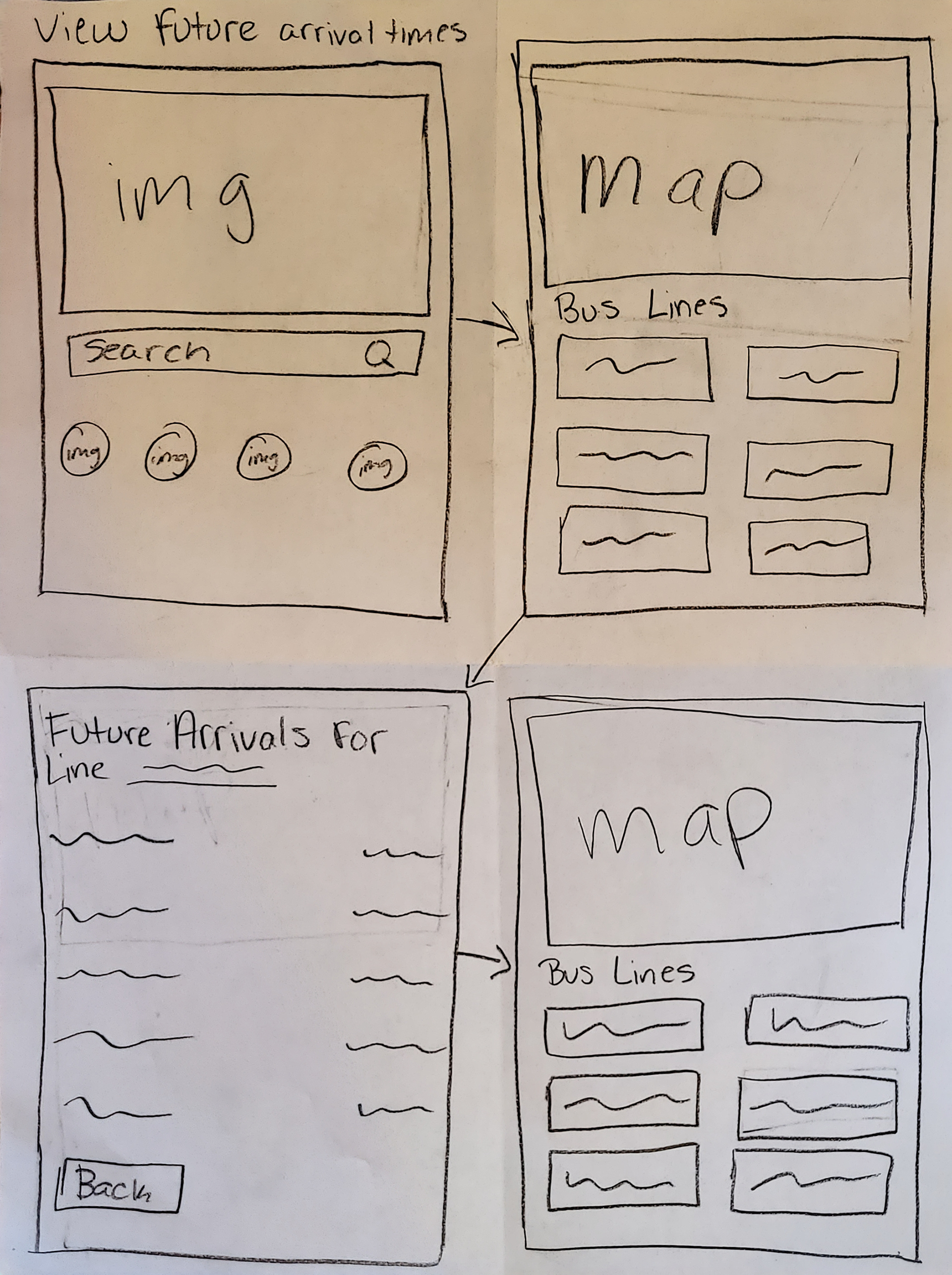
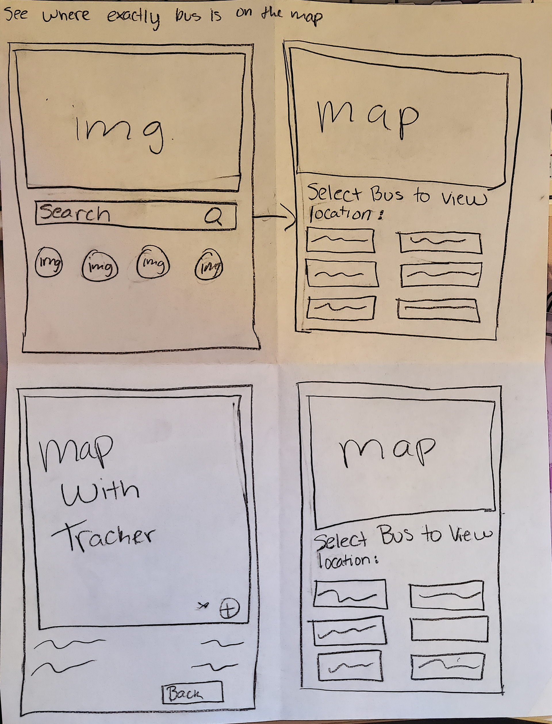
The solution was to ensure that any rider could tell when each bus would arrive at the Washington & State bus stop. Ensure that all riders can tell how much time they have to get to the Washington & State bus stop before the bus they need arrives at that stop. Another solution was to allow riders to select one of seven bus lines to see a list of its future arrival times at the Washington & State bus stop. The final solution was to allow riders to know the bus's location on the map.
Process
Discovery & Research
To gather information to create personas' motivations, goals, and frustrations, I needed to collect data from surveys I conducted throughout the process. From the first survey about public transportation, I learned that most users take the bus to save money on gas and car expenses. Another reason is they never have to worry about parking and parking costs.
The data also concluded that most users missed the bus because it was early, then coming in second was the bus being late.
Most users waited less than 15 minutes for their bus to arrive, with a small percentage waiting more than 30 minutes.
Pain Points
The cumulative pain points users encountered were that most apps already on the market did not access their local bus system. Users did not have many selections for apps. Another pain point was that most users were from out of town, causing them not to understand how the apps on the market functioned and that they seemed overwhelming.
Competitive Analysis
Transit
The first competitive analysis I completed was for Transit. This application has a clean overall feel to the interface aspects. It also has most major cities within the United States integrated into its data to be one of the most geographically diverse applications next to Google Maps. The downfall of this application was the overwhelming amount of information thrown at you and the number of clicks it takes to achieve your goals.
Moovit
The second competitor analysis I completed was for Moovit. This application had a clean feel to the user interface comparable to Transit. The color-based icons used throughout the app made the overall user experience and user interface a pleasant experience. These icons made it easy to understand how to complete your goals.
The downfall of this application is comparable to Transit, the overwhelming amount of information, unreliable schedule, and updates within the application. Moovit was the stronger of the two competitor analyses completed.
Information Architecture
Personas
From the data collected from the survey, competitor analysis, pain points, and business requirements, I created two personas to help me focus on the features I needed and didn’t need in my app.
Lilith Mcphee
The first persona created from the data collected from the surveys and interviews was Lilith Mcphee. She is a college professor with both morning and night classes. Her schedule is hectic, which causes her to miss the bus frequently due to her unpredictable schedule.
Kaylem Brook
The final persona created from the data collected was Kaylem Brook. He is a technical services engineer at a company located in Chicago. He has a hybrid work schedule, so he has to randomly leave for work depending on any issues that call for a meeting. He has been late and caused his team to delay fixing issues on several occasions.
User Stories
From all of the information collected, provided, and the personas I created user stories:
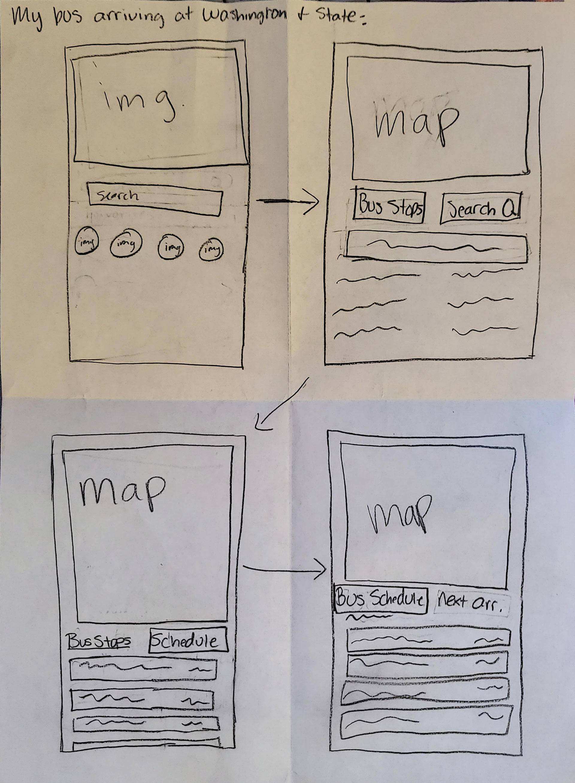
“As a bus rider, I want to know when my bus is arriving at the Washington & State bus stop, so I can calculate how much time I have to reach the bus stop.”
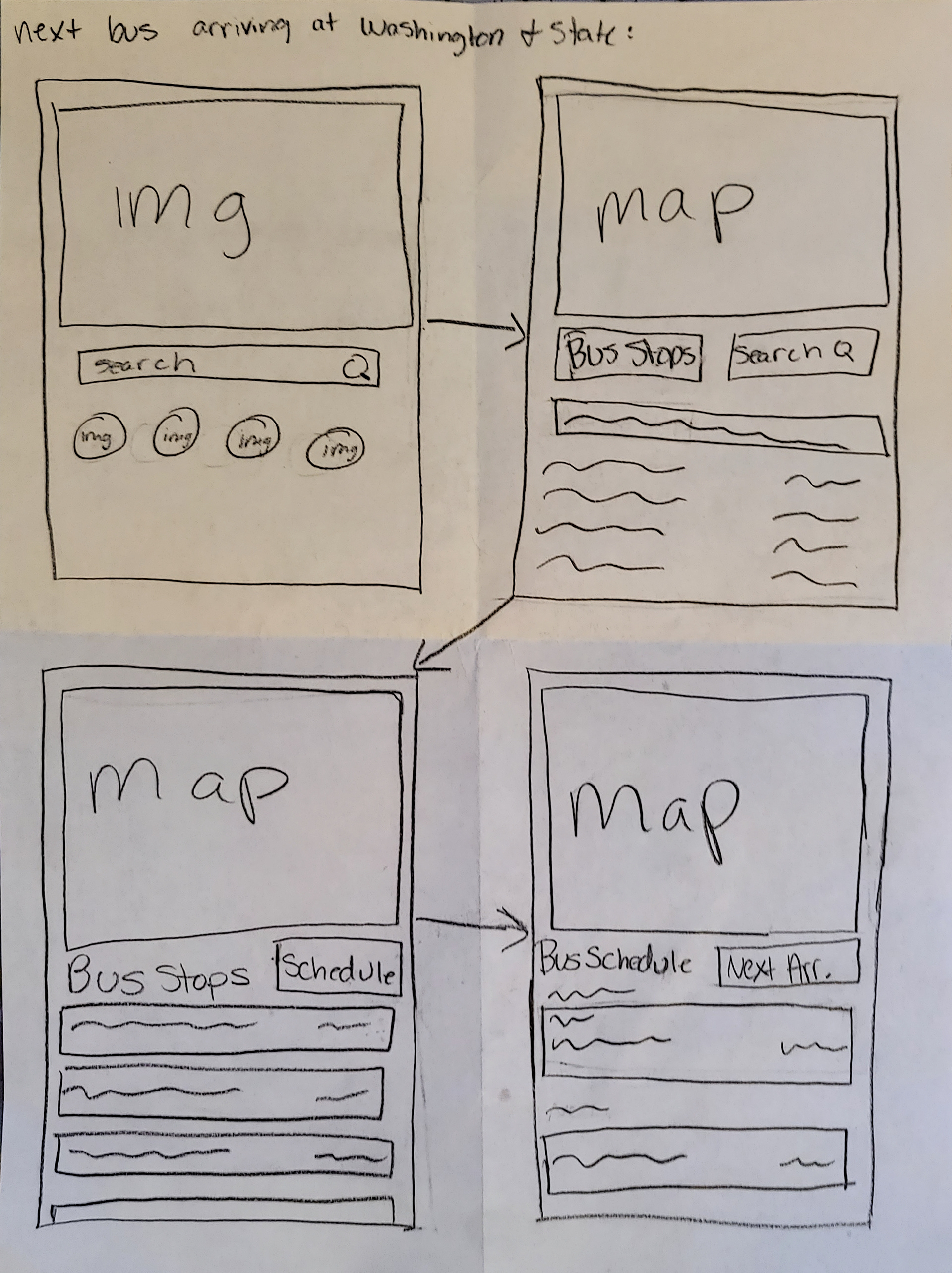
“As a bus rider, I want to know the next arriving bus at the Washington & State bus stop, so that I don’t have to rush to the bus stop if it is not my bus.”
“As a bus rider, I want the ability to view future arrival times for any of the seven bus lines (serving Washington & State) so that I know when my bus arrives.”
“As a bus rider, I want the ability to see exactly where my bus is on the map so that I can keep accurate tabs on any interruptions.”
User Flows: First Iteration
Sketches:
Digital:
User Flows: Second Iteration
Sketches:
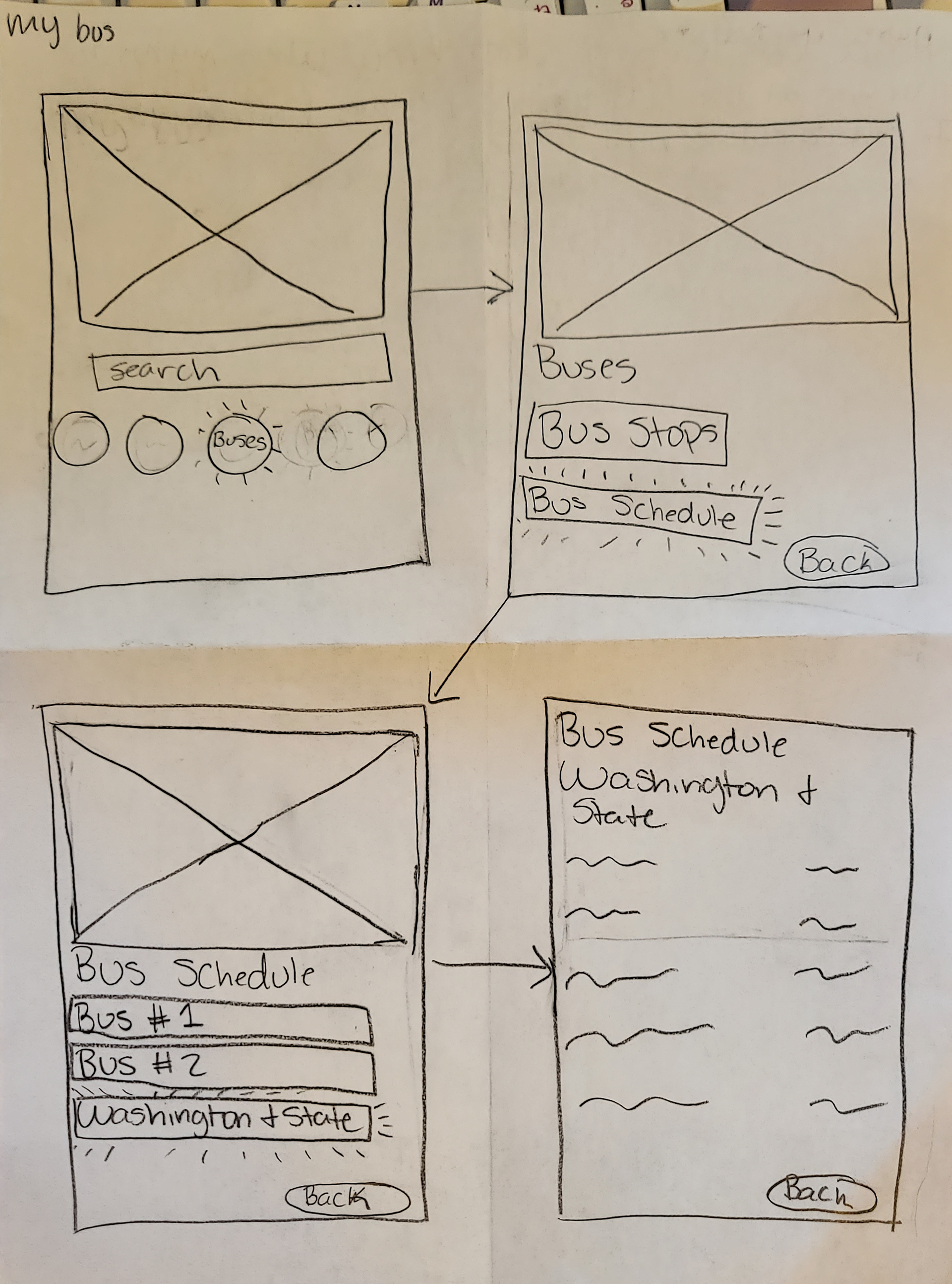
My bus user flow
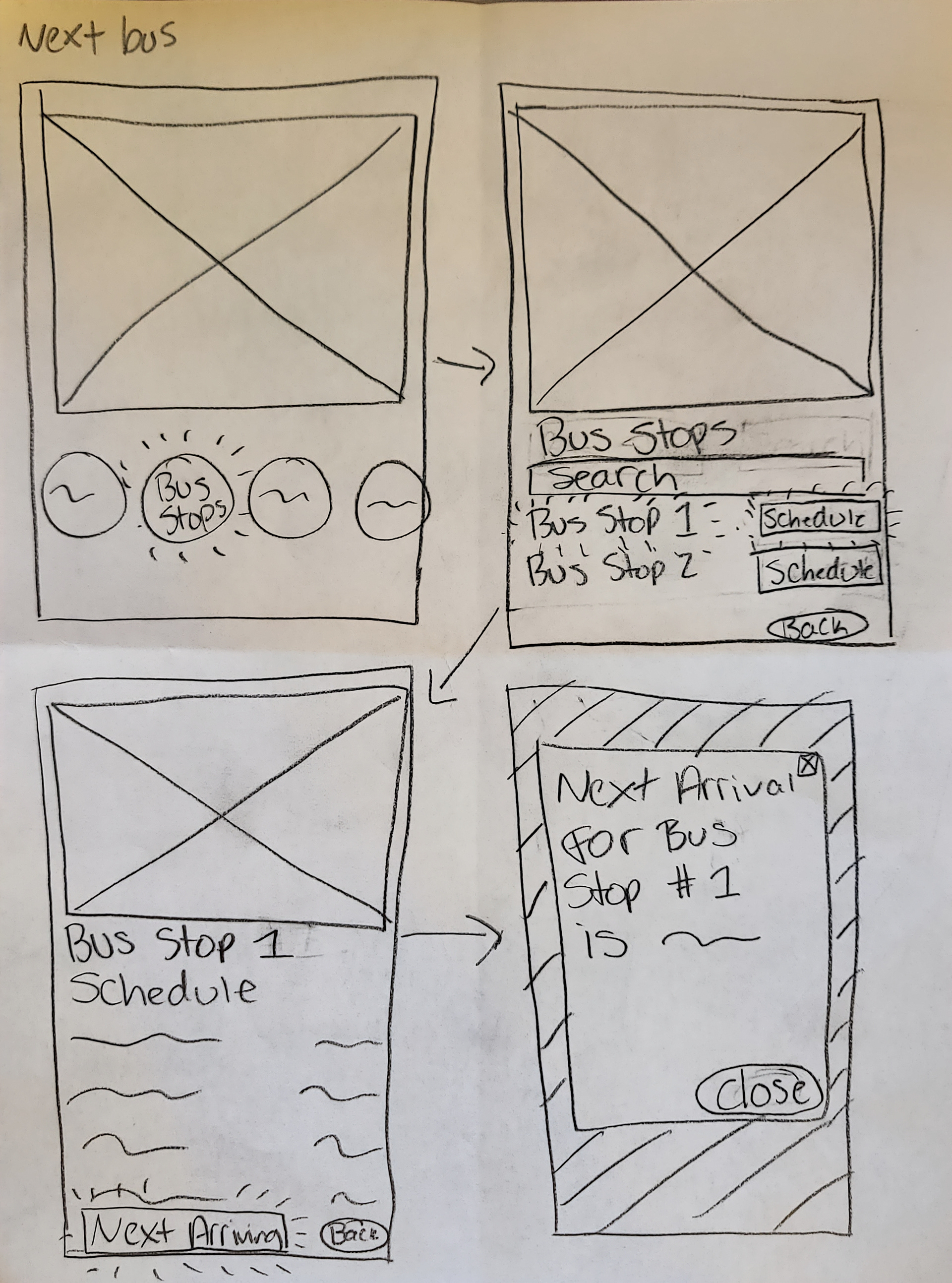
Next bus user flow
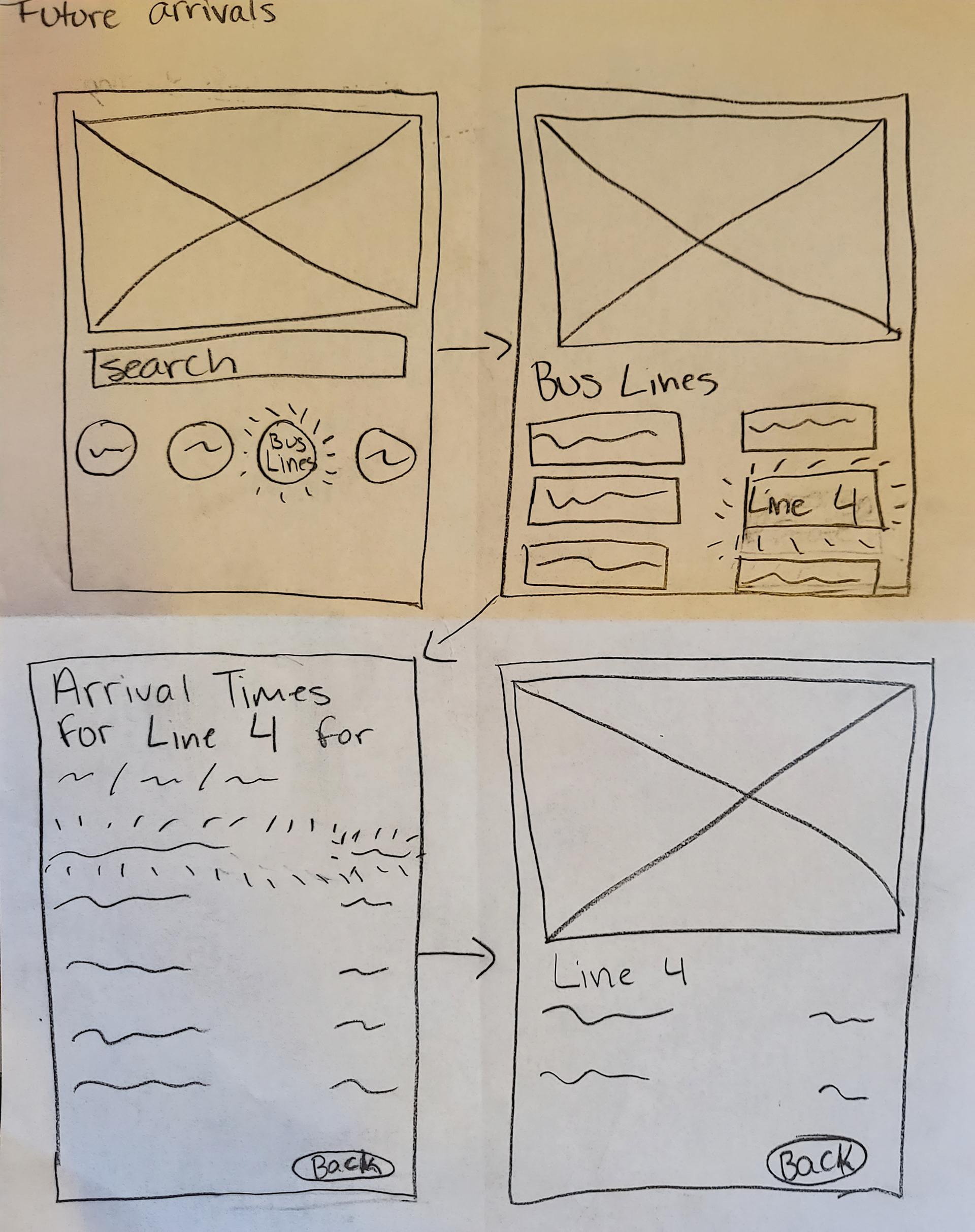
Future arrivals user flow
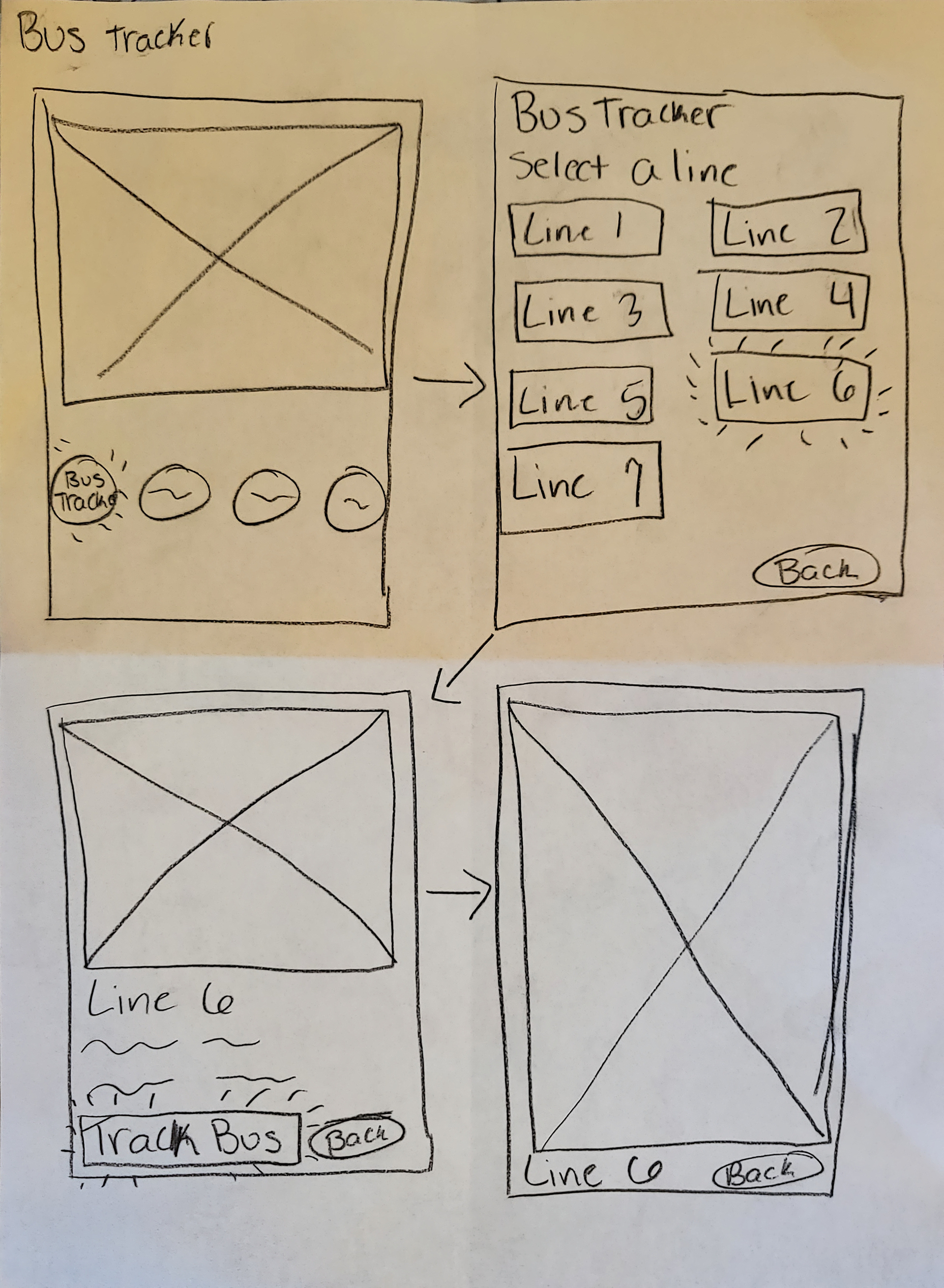
Bus tracker user flow
Digital:
Wireframes
Sketches: First Iteration
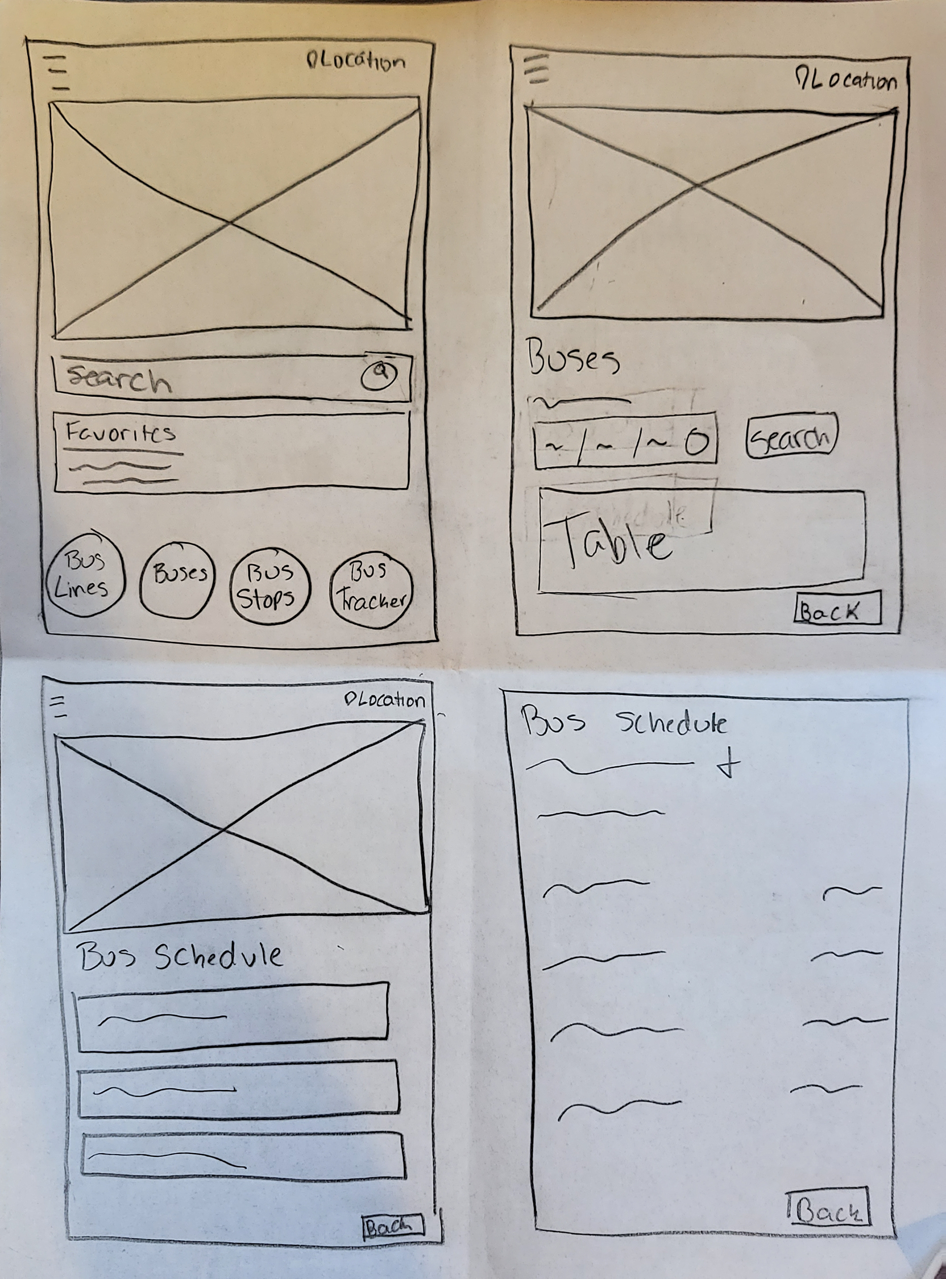
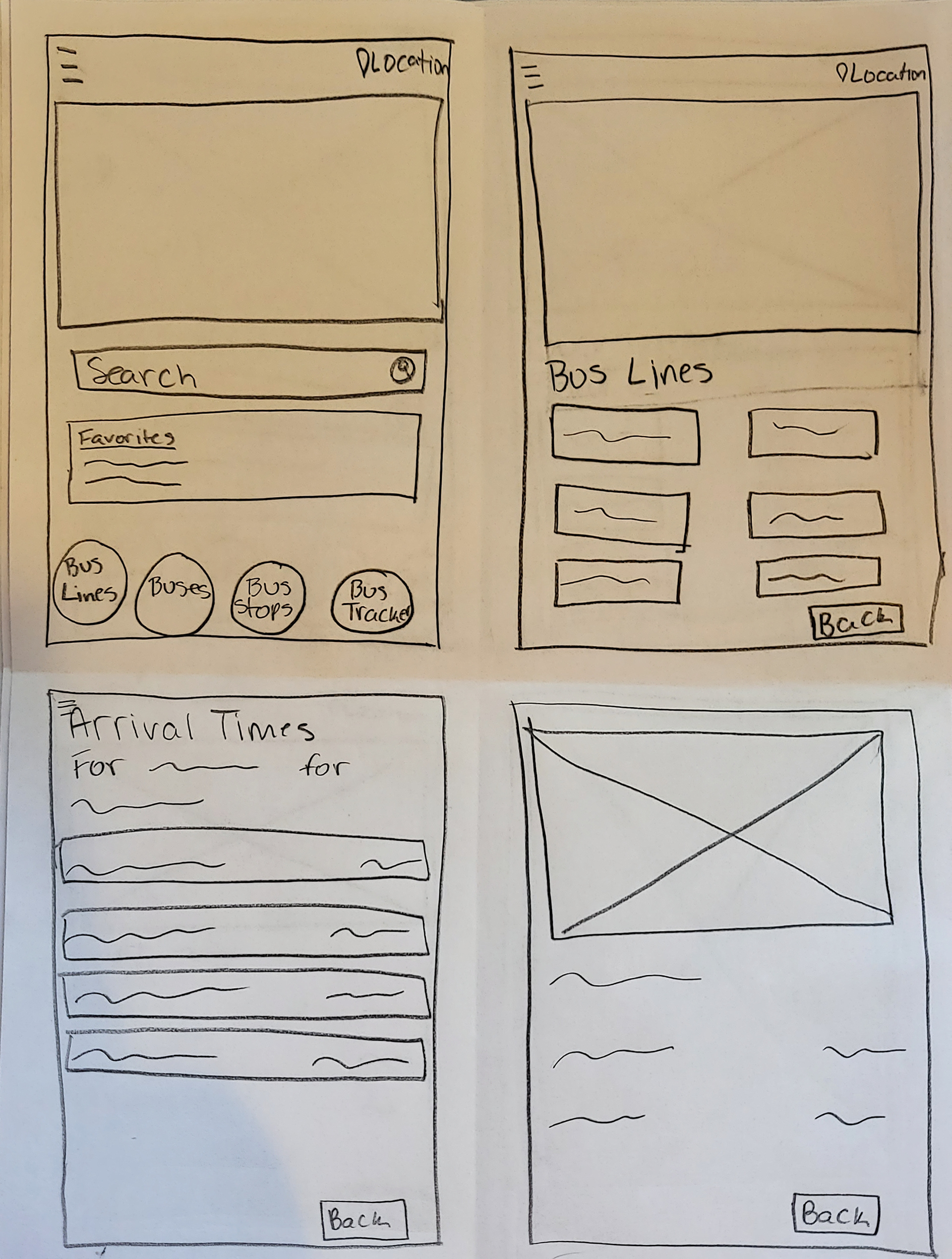
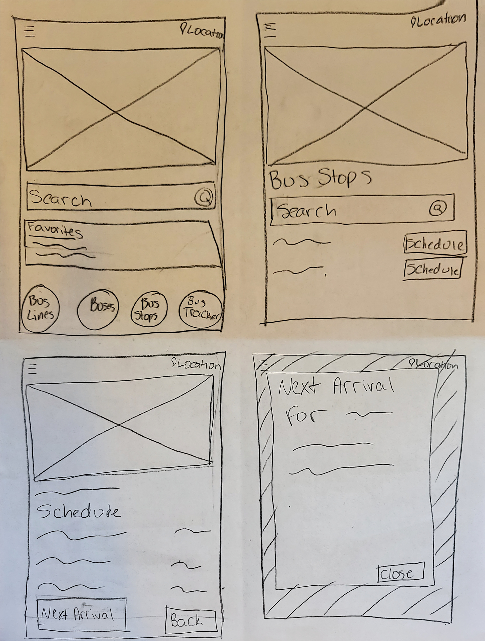
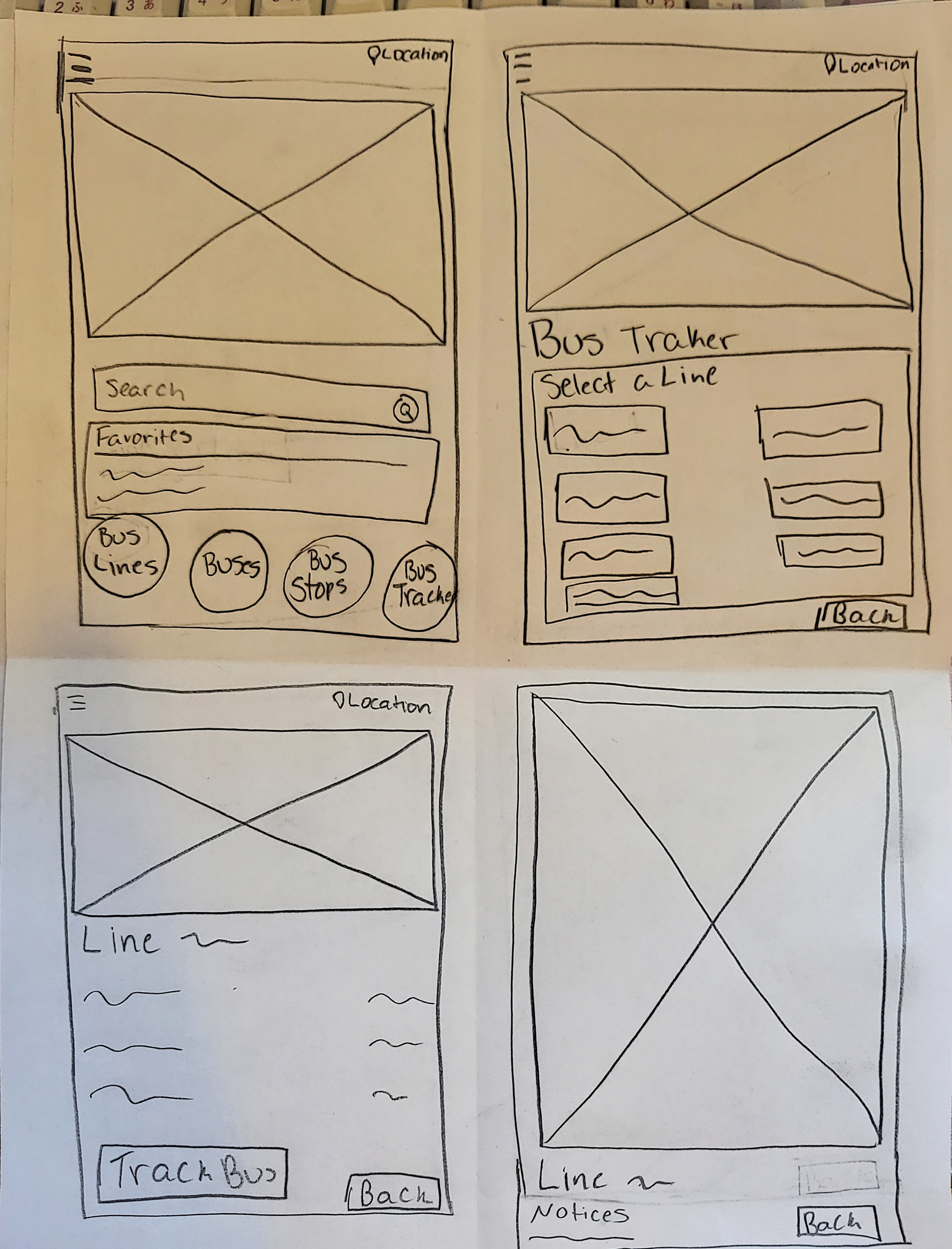
Digital: First Iteration
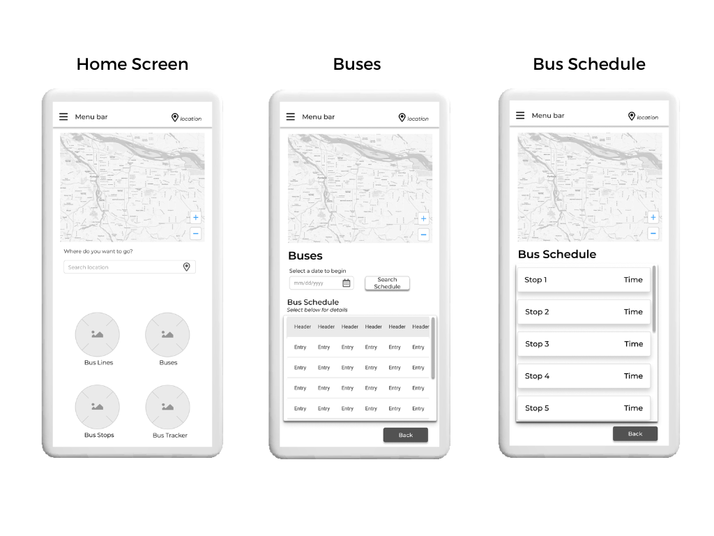
Home screen, buses page, and bus schedule page
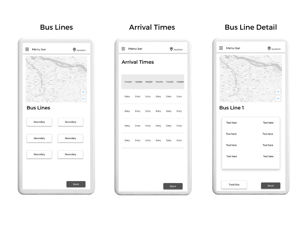
Bus lines page, arrival times page, and bus line detail page
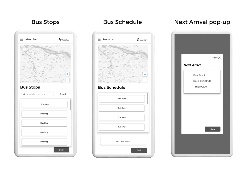
Bus stops page, bus schedule page, and next arrival pop-up
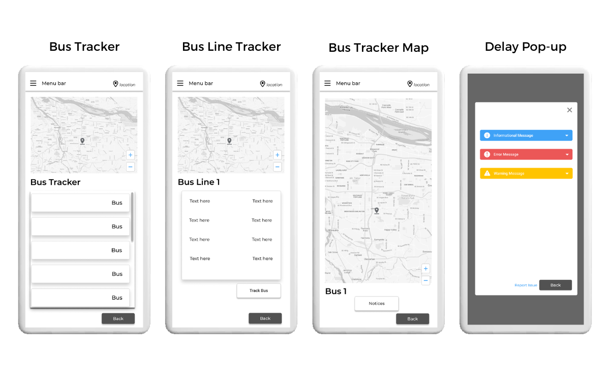
Bus tracker page, bus line tracker page, bus tracker map page, and delay pop-up page
Digital: Final iteration
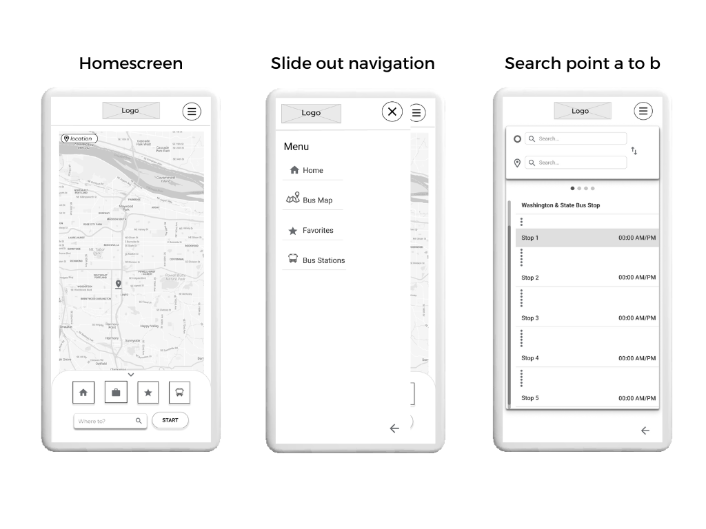
Home screen page, slide out navigation, search point a to b
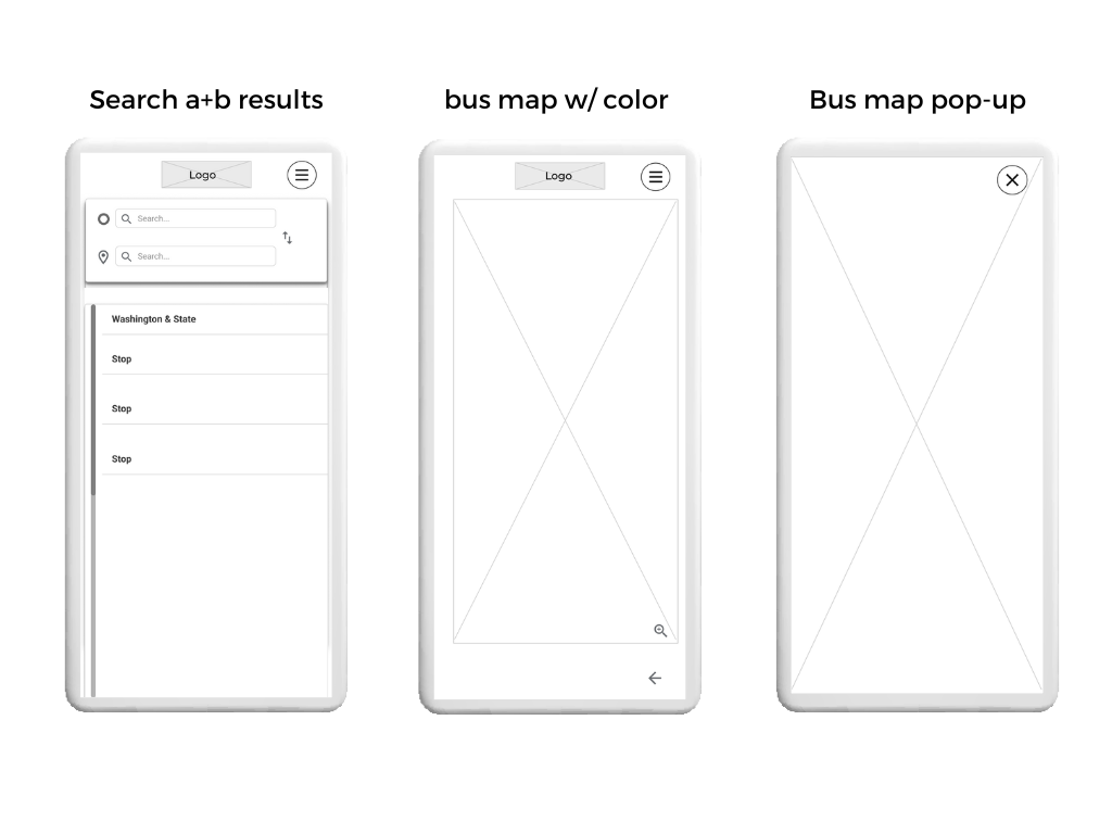
Search a+b results, bus map with color, bus map pop-up
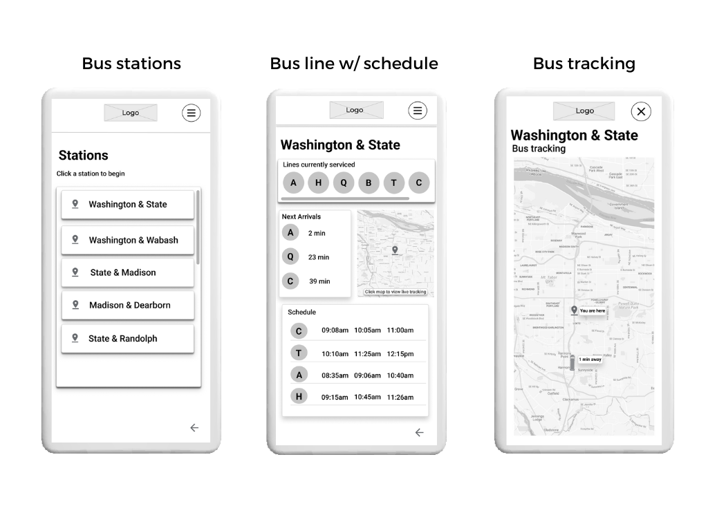
Bus stations, bus line with schedule, bus tracking
Brand Development
Brand
The brand characteristics were to take in the local vibe and characteristics of Chicago as a city in itself. The simplistic and clean look of the architecture, the white of the winter, and pops of color from nature, such as flowers and trees, were the inspiration for the colors used.
Color Palette
My color palette, inspired by Chicago city itself, from the pops of colors in nature and the simplistic colors of architecture throughout, created a clean and minimal look for the project.
Design Inspiration
My design inspiration for ChicaGO is designed around Chicago's daily lives. The classic architecture, nature, and monuments make a statement just like the user experiences and interfaces created within the application.
Typography
The typography used was representative of the clean, beautiful, and simplistic Chicago architecture. So, I chose to use Montserrat throughout the app as the sole font to not cause any distractions from the actual user experience and for accessibility purposes.
Mockups
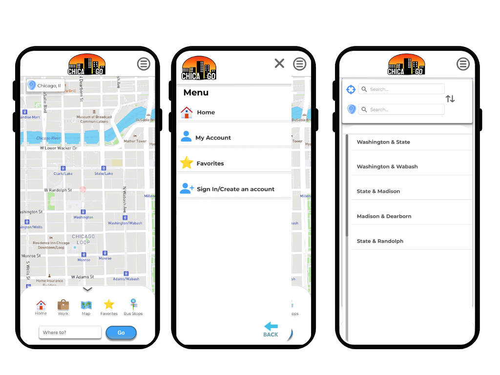
Home screen, slide out navigation, search points
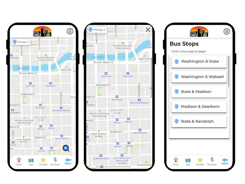
Map, enlarged map, bus stops
