App design and creation for pet adoption
Introduction
2022/Mobile App
Role:
I worked on the: Usability testing, Surveys, Sketches, Low-fidelity prototypes, High-fidelity prototypes, Research, Competitive Analysis, Interviews, User Personas, Wireframes, & Brand Logo creation.
Date:
Spring 2022
Summary
The goal was to create an app that made adopting and searching for a future pet easier, less overwhelming, and less stressful. The idea was to ease the frustration, save time with the adoption process, and the ability to search for a future pet whenever and wherever you want, without leaving the comfort of your home or bed.
Problem
Adoption is overwhelming and can be a tedious process. There are a couple of online applications that make adoption easier, but not less overwhelming.
The issue with adoption is that there are too many pet options listed across several applications and websites, which makes deciding on which pet to adopt a difficult decision.
Visiting a shelter isn’t easy for most people, especially if you aren’t sure you would find your perfect fit at that shelter.
Solution
The solution was to create an environment that made searching less overwhelming by having fewer options present at one time and being able to go back and forth with your favorite options to reference at a later time. Other solutions that were brought up were being able to schedule a day and time to meet with a potential pet to make things less hectic.
The final solution was to integrate a personality test to filter out matches that wouldn’t be a perfect fit so that the user can focus on their compatible matches.
From the data collected, I began creating my low-fidelity prototypes. I started improving upon the user experience you would see within Tinder and PetFinder.
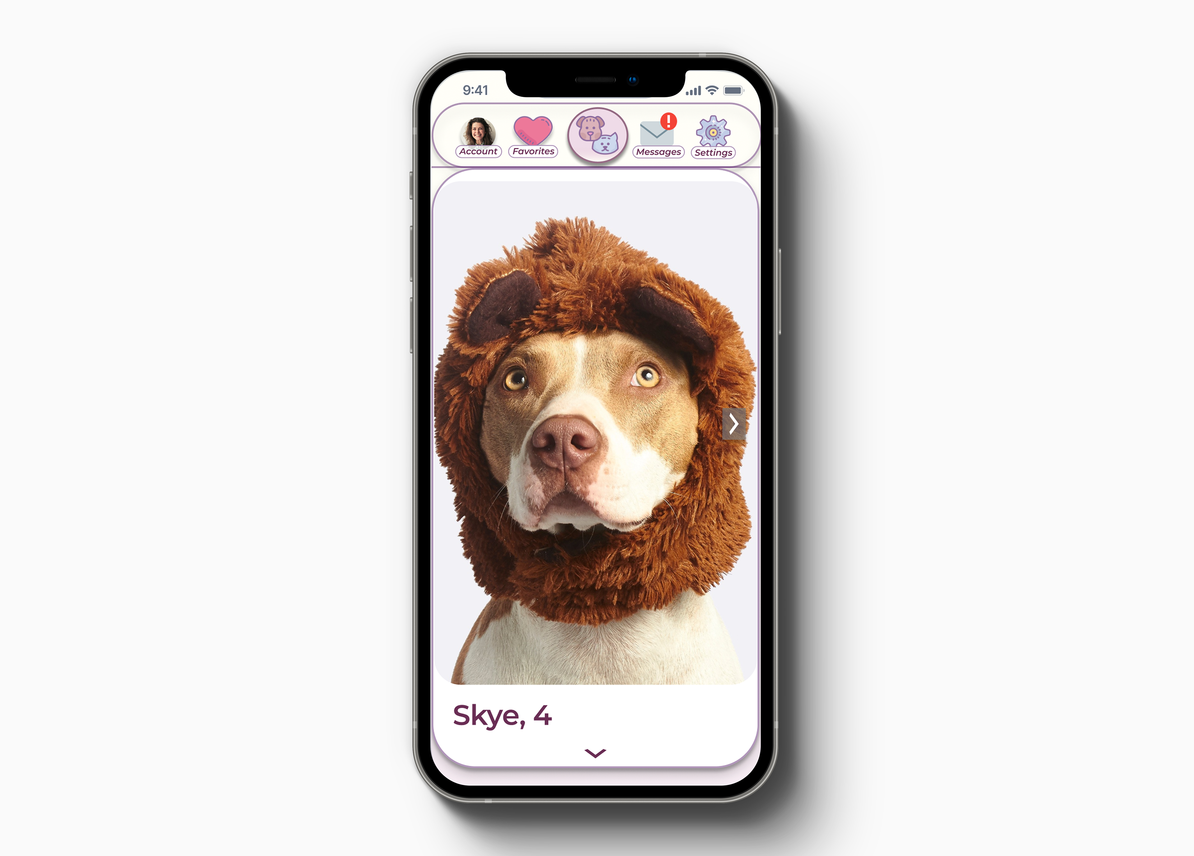
Pet Profile Page
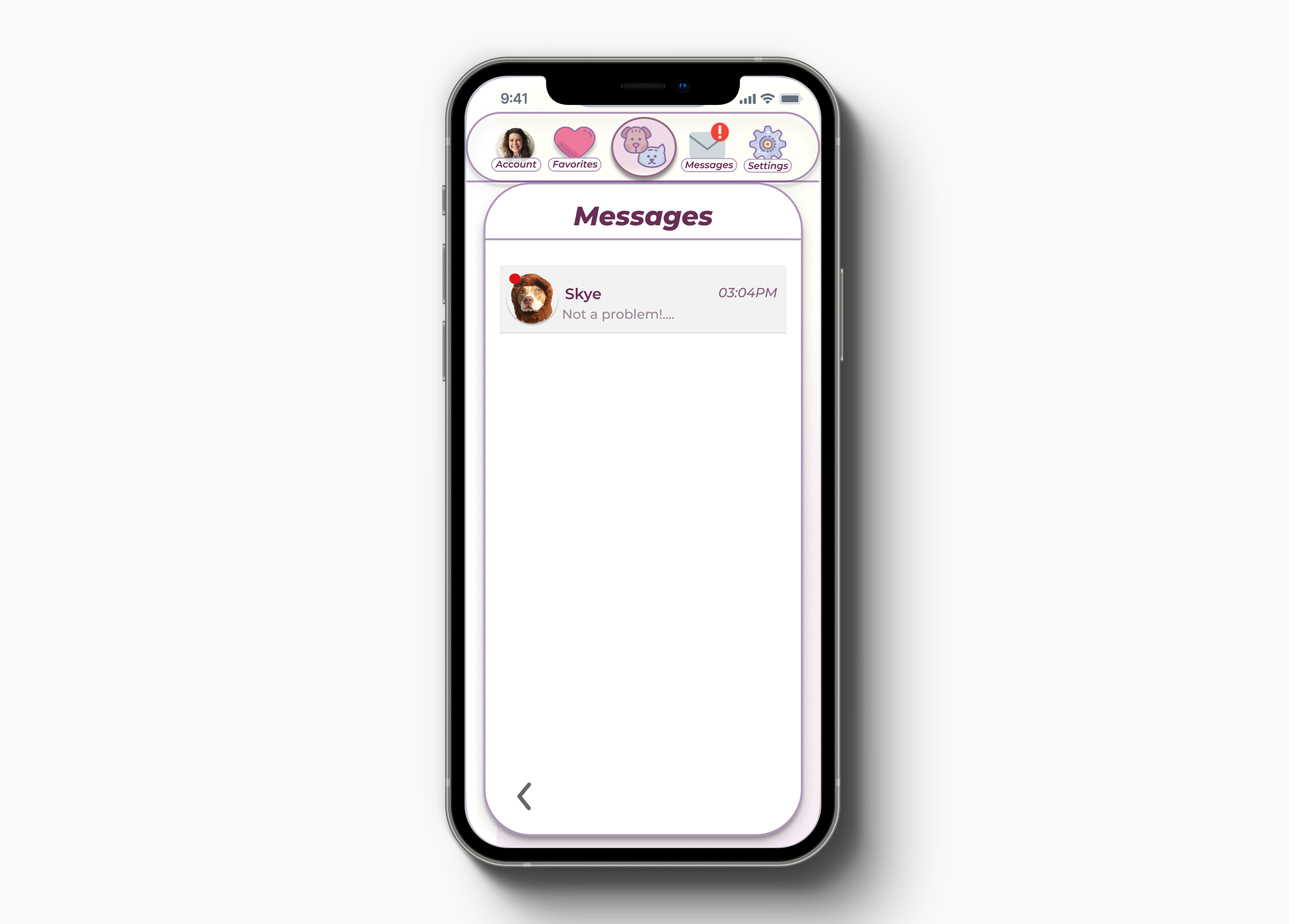
Message Page
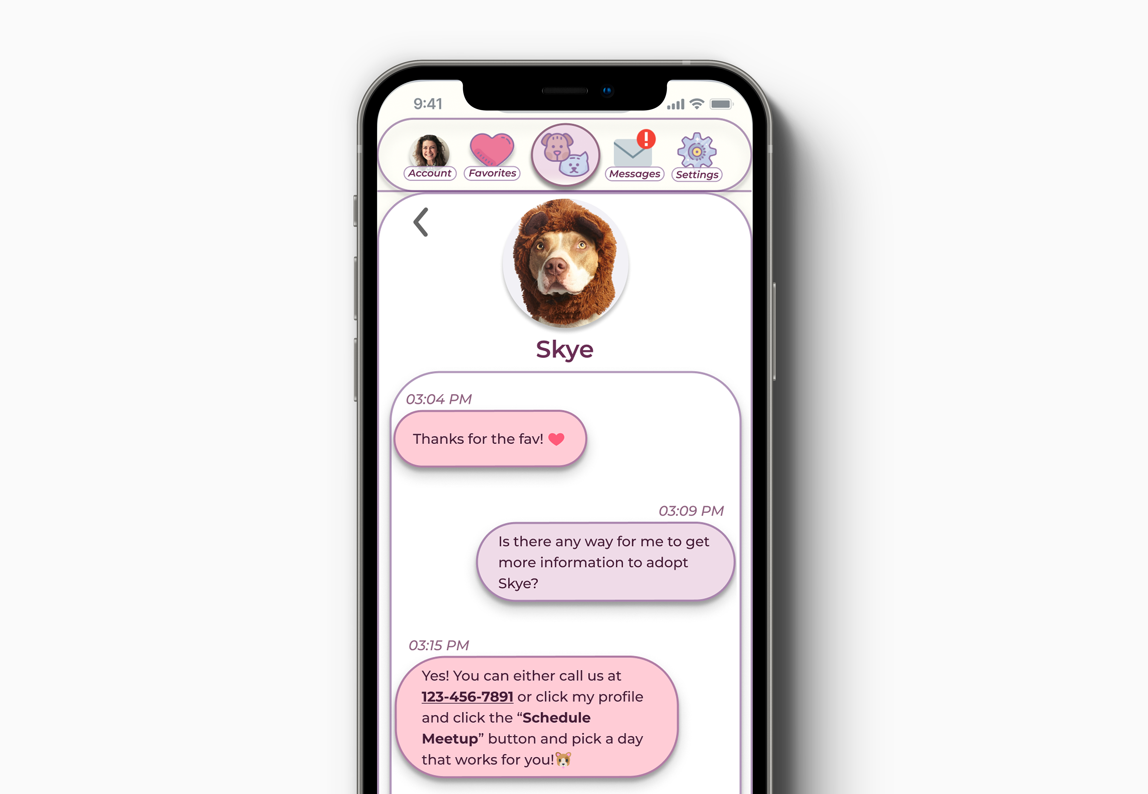
Message Detail Page
Process
Discovery & Research
To gather information to create personas' motivations, goals, and frustrations I first needed to collect data from surveys I conducted throughout the process. The results from the first survey I conducted, of which 11 users were surveyed, I learned that most users were interested in adopting a pet, the only reason for their interest in not adopting a pet was that they currently had the number of pets desired.
From the data collected on the users surveyed, over half of the users had used another form to view adoptable pets. Of these websites and alternative options, the two most popular were Pet Finder and visiting their local humane society or shelter.
The data that I collected mentioned above, concluded that most users felt using the human society, local shelter, or PetFinder overwhelmed them in their adoption process.
The results I gathered led to the conclusion that having the ability to take a test to match your personality to the pets available would make things less overwhelming and create perfect fits. The test would result in a lower percentage of adopted pets returned to shelters.
Pain Points
The pain points users encountered were that the available options for viewing adoptable pets were through a website that listed too many options at once, making the decision to adopt almost impossible. The other option was to visit a local shelter but most people don’t have the transportation options or time in their day to make a trip to a shelter to find out none of the pets available for adoption would be a great fit, leaving them walking out empty-handed.
Competitive Analysis
PetFinder
PetFinder came across as very overwhelming, where a user might be struggling to find a way to start the process. When they did start the process, the options listed were overwhelming and made making a decision on just one pet difficult.
Tinder
While Tinder is a human matchmaker application, I was inspired by its simple swiping mechanism and less aggressive display design compared to Petfinder.
Information Architecture
Personas
The data collected from the survey I held, the competitor analysis I compiled, the pain points I researched, and the business requirements I needed to hit, I created two personas to help me focus on the features I need and didn’t need in my app.
Valerie Pope
The first persona I created from my survey results was Valerie Pope, who has a busy schedule and her children have been begging for another pet. She currently has a male cat and isn't sure how he would feel about some competition for attention.
After discussing the idea with her husband, they decided to give it a shot and see if they could find the perfect fit for their family and their cat.
Wayne Morris
The second persona created from the collected data was Wayne Morris. He is single and lives in a luxury apartment in the busy city of Atlanta, Georgia. He has longed for a companion since his late 20s but was too busy to be responsible enough to care for another life.
Since his life has become more stable and he's getting older, he decided to adopt a dog to keep him company.
User Stories
I started on the user stories from the data collected and the personas created:
“As a user interested in adopting a pet, I want less information overload.”
“As a user interested in adopting a pet, I want to be able to schedule a time to meet a pet around my schedule.”
“As a user interested in adopting a pet, I want to be able to narrow my options down more.”
“As a user interested in adopting a pet, I want to find a pet that matches my personality and work-life balance.“
User Flows
From here, I created user flow sketches which are pictured below. Using the Crazy 8s method, I made the landing page to welcome the user to create an account/login or jump straight into taking the survey.
After taking the personality test, they are shown their results for their personality type based on their answers to the survey. Then, their personality type automatically applies as a filter to the swiping options.
If you decided to look at more detail about the pet, you could click their picture then their profile account would load. The pet's profile page contained specific medical needs, age, gender, and basic information needed. From here, you could favorite the pet, adding it to your favorites within your account.
If you decided to look at more detail about the pet, you could click their picture then their profile account would load. The pet's profile page contained specific medical needs, age, gender, and basic information needed. From here, you could favorite the pet, adding it to your favorites within your account.
If you decided to move along with the adoption process you could schedule a date and time to meet with the pet and even fill out an adoption form if you were already 99% sure before meeting the pet in person.
Digital User Flows
From the sketches of the user flows, I created the digital user flows.
Digital Wireframes
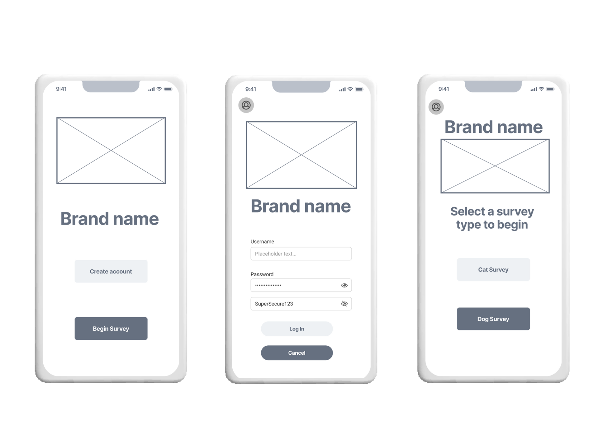
Landing page, log-in page, and survey landing page
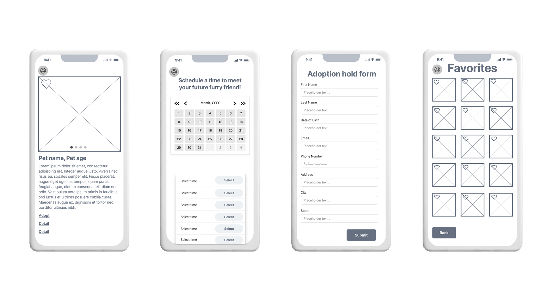
Pet profile page, schedule meet-up page, adoption form page, favorites page
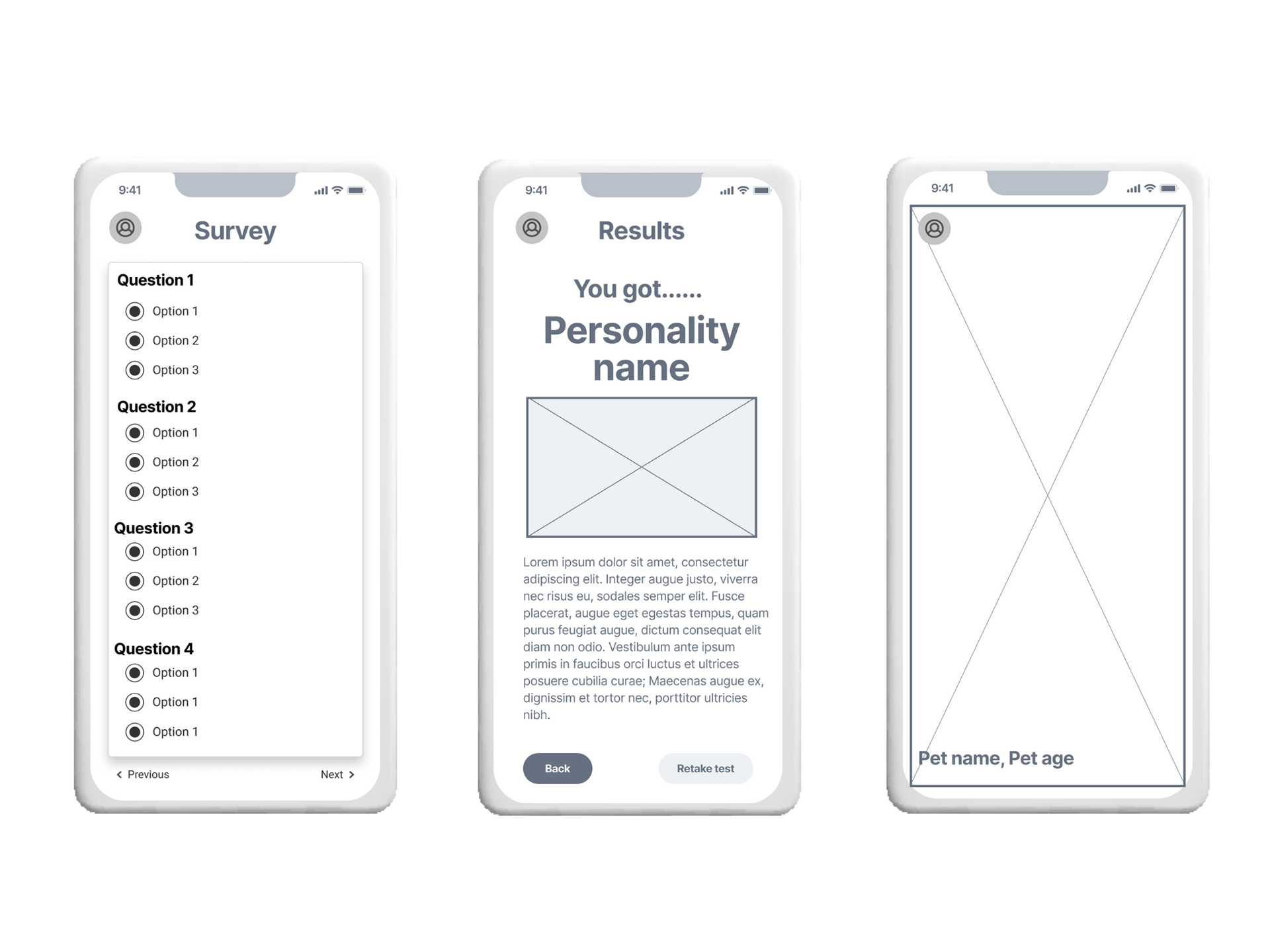
Survey page, survey result page, and swiping page
Brand Development
Brand
The brand characteristics I was aiming for were to create and design something fun, colorful, playful, and eye-catching. The goal was to design an application that not only improved and created a frictionless user experience but create a design that kept the user's attention and made them want to return to the application.
My main inspiration for this project was Tinder. The ease of use and the functionality were key insights from my competitor analysis. I wanted to incorporate a unique way to adopt a pet and this was one of the ways to do that.
Swiping Mechanics
Inspired by Tinder's swiping mechanics to improve the overall user experience, I incorporated this functionality into my project. After some usability testing and research, I realized this function alone was not accessible to everyone. In the final iteration, I ended up adding to it to make it accessible.
Color Palette
I decided to stick to cool tones, purples, and hints of yellow and white to break up the overall color palette. I didn't want the application to become overwhelming, but wanted to give some pops of color here and there. I used shades of purple because they invoke feelings of calmness, luxury, and power.
Typography
The typography choice I made was to express cleanliness and simplicity, while also being a bit bold. So, in the end I chose to use Montserrat throughout the app as the sole font for a cleaner layout and accessibility purposes.
Prototype Process
First Iteration
My first iteration included a simple heart and an X as the indicator when you swiped left or right. This iteration had a basic menu bar.
After testing, I learned that the users found the swiping confusing to grasp. The pet profile was confused with the swiping page version when asked to look at more information about the pet.
Favorites were confusing to find, causing the task to take longer than it should have. There also wasn't a clear indicator of when the swiping page had reached its end.
The users enjoyed the design concept and the personality test to help find their match. They found the ability to schedule a meetup incredibly helpful and a time saver. The users found the favorites page helpful when referencing their favorites and looking at their profiles.
Second Iteration
After testing the changes made from the feedback of the first iteration, I continued with the second iteration. The changes for this iteration included an updated menu bar to make the usability easier and less confusing and changed the like/favorite and skip/dislike to gifs that represented the actions better. To improve accessibility, a menu with buttons was added to the bottom to act as a swipe alternative that was accessible to people that don't have much mobility.
The usability results indicated a need to update the meetup calendar to improve usability functionality and make the selection clearer to the user on the meetups page. Swiping gestures to assist with using the app were added to the messages, pet swiping page, and pet profile to eliminate confusion. The Plenty of paws logo was re-branded to match the final color scheme and aesthetic.
The usability testing results were that users thought the account profile seemed lackluster. The feedback was that the buttons and wording were confusing, specifically the "scheduled meetups button."
Users liked the "coming soon" animation so the user knew they were at the end of the available swiping options and that more would be coming. The users also enjoyed the swiping gestures since they made things less confusing and guided them to what they could do on the page instead of being left guessing, especially as first-time users.
Added animations
Added animations for loading visualizations. The animated gifs also included the coming soon image to let users know they reached the end of the swiping function for the prototype.
Final Iteration
The usability testing showed that the user account profile buttons needed to be updated to add icons with text to match the design concept. The addition eased the confusion of the account profile button destinations and improved usability test results.
Mockups

Landing Page
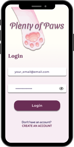
Log-in Page
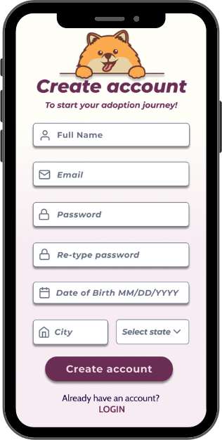
Create Account Page
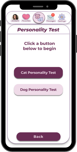
Personality Test Page
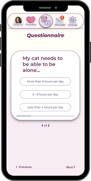
Questionnaire Page
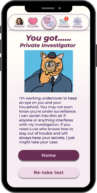
Cat Results Page
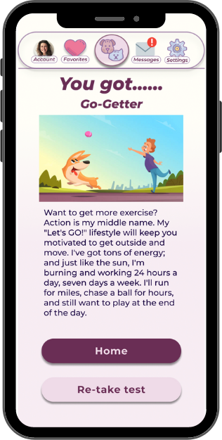
Dog Results Page

Swiping Page
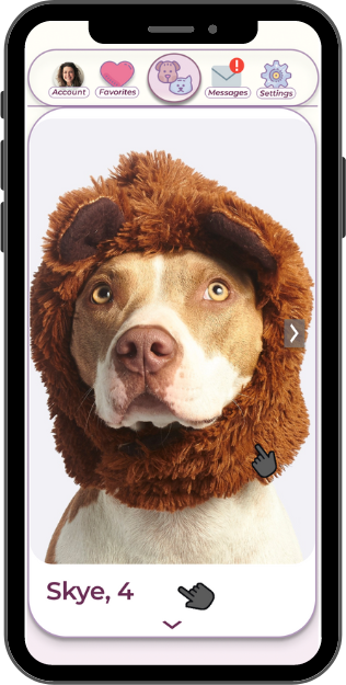
Pet Profile Page
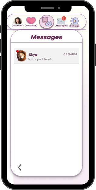
Messages Page
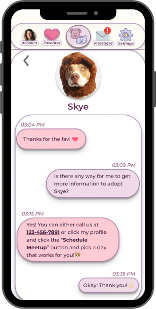
Open Message Page
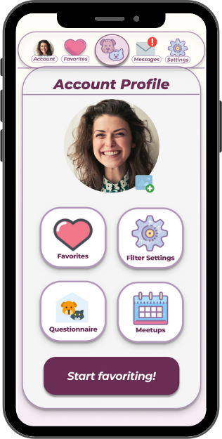
User Account Page
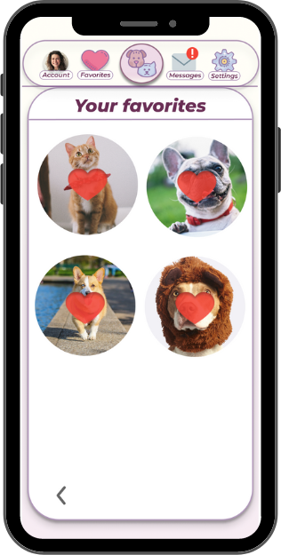
Favorites Page
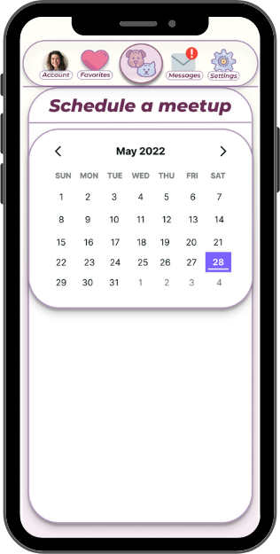
Schedule A Meetup Page
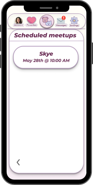
Scheduled Meetups Page
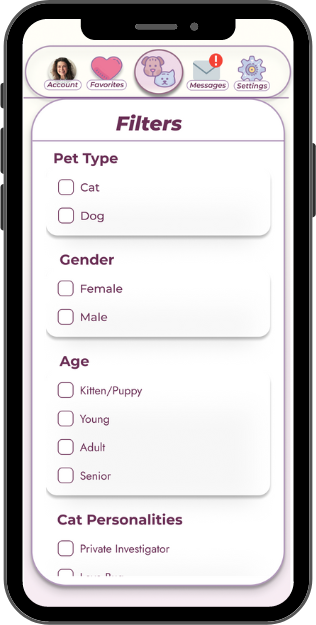
Filter Page
Final Thoughts
Creating and designing Plenty of Paws was a tremendous learning experience for me since it was my first project that included complex interactions. While I feel that Plenty of Paws could be successful and succeed as a pet adoption application, I do feel there are a few areas that could be improved upon. That list includes:
•Adding a function to be able to go back to an accidentally skipped or disliked pet.
•Implementing an adoption form and deposit payment process to hold the pet until the meetup occurred.
•Adding a playdate option for current pets to make friends and socialize.
What I learned
I learned that it is important to incorporate alternative options to swiping for people who have mobility issues. It didn't fully occur to me to include it in my prototype, but I did and I'm glad I did because it's fully accessible and inclusive to everyone.
I also learned that user testing is important to be done right and thoroughly. I did several rounds of user testing until I was satisfied with the results of the testing. I wanted to incorporate people that had been previously testing on previous iterations and new users to see if they also succeeded at the tasks.
